Logo & Identity Design
"Working with Kane to create our identity has been fantastic. His first designs were spot on – delivering three beautiful drafts that each offered strong directions to choose from! My business partner and I were happy to move forward with a fantastic wordmark he created, and Kane quickly produced final files with brand guidelines to match! His understanding, turnaround times and communication were brilliant throughout our project – great work!"
— Ian, Kabuki Hairdressing
Kabuki is a new hair salon open in Loughborough with team of professional stylists. The owners Joe & Ian approached me in April 2020 looking for an identity that appeals to Loughborough’s high population of students, but wasn’t too modern to discourage older clients too. They had a botanical vision for the salon interior and therefore needed an identity that didn’t look out of place amongst Monstera plants and Bonsai tree’s too.


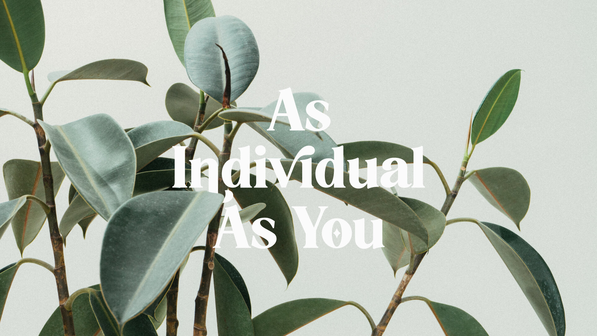
As Individual As You
Our logo objectives were to create a design that appealed to students, would look at home in a botanical setting, whilst being warming and approachable enough to welcome older age groups too.
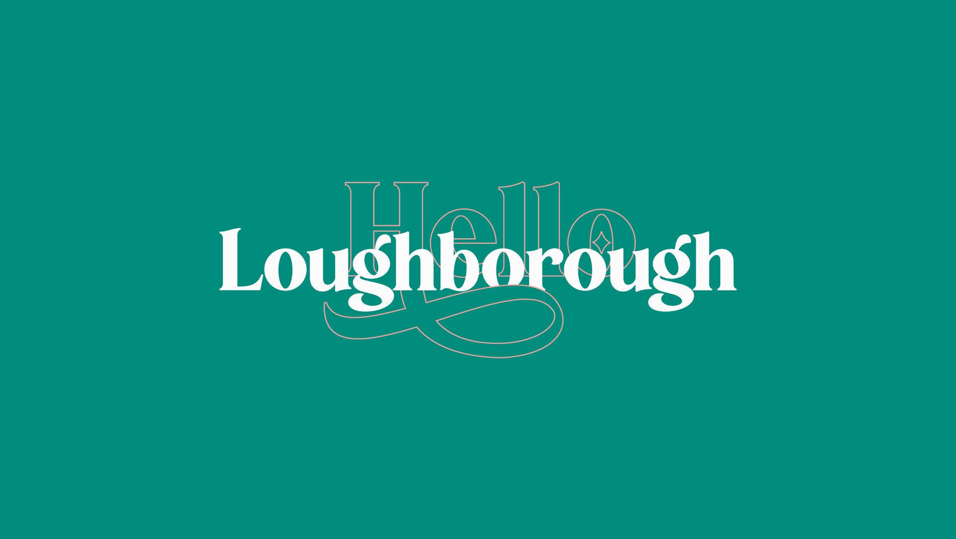
To meet these criteria, I’ve created a unique serif wordmark; using extended terminals and stems to add flourish, representing hair styles and botanical plants. This independent but brave design can inspire clients to adopt their own unique identity whilst creating a lasting and memorable appearance for the business too – fitting of their strap-line “As Individual As You”.

The colour palette uses soft pinks and bold greens to work in contrast. When together, they create a confident but sophisticated appearance – grabbing attention without being abrupt. Used independently, the shades of pink offer a more subtle approach. This option is perfect for materials targeted at existing clients – allowing warmer connotations.


Font & Layout Structure
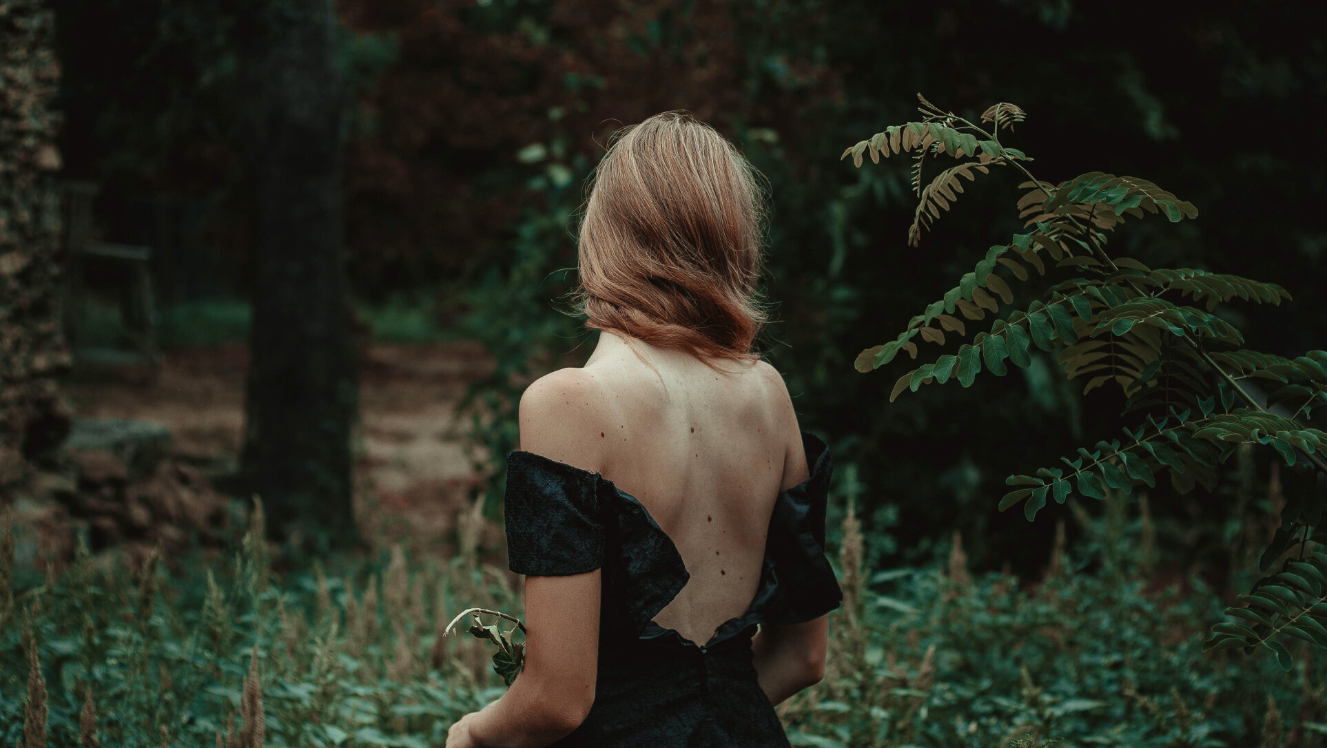
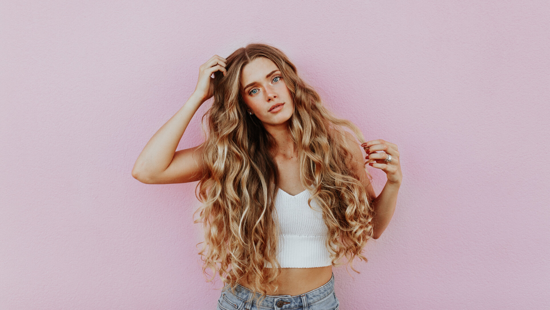
To support the logo, I’ve selected Titling Gothic as the secondary font – used for print materials and the Kabuki website. This is a clear and versatile typeface with many font weights, supporting contemporary yet calming layout structures. These designs are setup to focus on the photography – keeping focus on the model and their individual style.
