Logo, Identity & Packaging Design
"I’ve worked with Kane time and time again; both for Roast Kings and my own client projects as a Marketing Consultant, simply because you can’t fault him. His speed and ability to transfer faint ideas in to actual designs (that are far better than anything I could image) is priceless! If you’re on the fence about a Graphic Designer, look no further!”
— Nathan – Marketing Consultant, Roast Kings
Roast Kings are a new meal delivery start-up based in Somerset. With decades of experience running successful restaurants and bars, Richard (Founder) approached me with the task of creating his new brand identity!
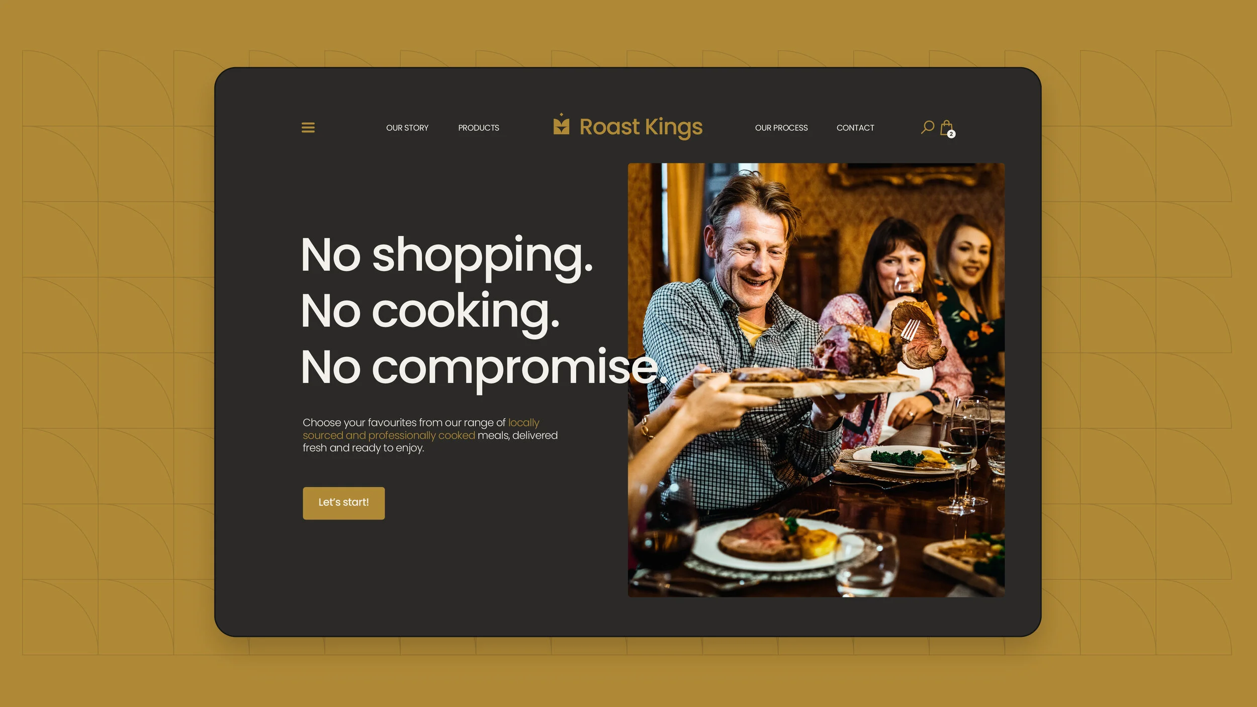
The team deliver the highest quality roast dinners nationwide, with next day delivery and a great selection of meat roasts, sides and vegetarian/vegan options too. Our aim was to create a modern, bold and established identity that delivers a sense of quality and ease – delivering customers their fantastic roast dinners with no shopping needed, and no cooking required.
Order your roast here: https://roastkings.co.uk/

I’ve created the icon mark using four quarter circles – the two on the left form an 'R' shape, and this is reflected on the right, forming a backwards 'K' shape. The icon displays as a formally balanced crown, and sits alongside a confident and legible sans serif to form the primary Roast Kings logo.
This confident but refined image is carried throughout the new identity. Messaging is clear and legible with a white, grey and gold colour palette that carries hints of warmth and luxury. Products are delivered to bring people together. Spending less time with shopping, cooking and preparations – allowing for more time spent with loved ones, laughing, creating good times and enjoying beautiful food!


We see roast dinners as a personal experience; not to be rushed or seen as a generic meal! With the personal touch of cooking removed with Roast Kings deliveries, I was keen to replace sentiment. To do this I’ve created small personalisations across print, packaging, emails and more to maintain the customers connection with their meal(s) – giving more of a crafted and personal experience for every order.


I’ve featured a royal element to the identity, in the shape of Roast Kings’ wax seal of approval. This can be seen on meal packaging and delivery boxes – confirming the quality of food inside!
Food containers were needed in various sizes to cover all meals and sides, so we created a selection of cardboard sleeves. Range collections such as vegetarian and vegan meals are separated and identified with the dark grey replaced with green and blue earth tones.